INFOGRAPHICS
When you're pitching your business to a venture capitalist, it's important to use every tool at your disposal to make your case. One way to do this is by incorporating infographics into your pitch deck. Infographics can help visualize complex business models, flow charts, structures and more. This will help make your case more understandable and persuasive. In this page, we'll show you some of our samples on how you can use infographics in pitch decks to land your next big investment!
When you're creating a pitch deck for your business, there are a few things to keep in mind. First, you want to make sure that your deck is visually appealing. This means using high-quality graphics and images. Second, you'll want to focus on the most important aspects of your business. Third, and perhaps most importantly, you'll want to make sure that your pitch deck is easy to understand.
One way to ensure that your pitch deck is easy to understand is by incorporating infographics. Infographics are a great way to visualize complex information in an easily digestible format. By using infographics, you can help your audience understand your business model, how your product works, your target market, and more.
VALUE PROPOSITION SLIDES
A value proposition is a promise of value to be delivered. It's the #reason a customer would buy from you. And it's what differentiates your company from your competitors. Creating a strong value proposition is one of the most important things you can do for your business. It's what will help you attract and retain customers. And it's what will help you grow your business. Creating a value proposition can take some time and effort. But it's worth it. By taking the time to create a strong value proposition, you'll be able to differentiate your business, attract and retain customers, and grow your business.
SAMPLES
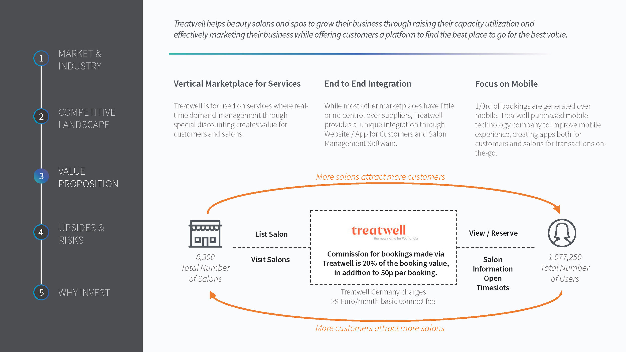
In the fast-paced world of startups and investment, clarity is king. This image from our work at aPitchDeck.com represents a finely tuned synthesis of business analysis, showcasing Treatwell's strategic position in the market. It maps out Treatwell's journey, highlighting its business model as a vertical marketplace for services, the end-to-end integration of its platform, and its sharp focus on mobile user experience. The visual encapsulates the essence of Treatwell's value proposition, competitive landscape, and investment potential, with precise data points like the number of salons listed and user engagement metrics. We've distilled vast amounts of information into an accessible format that emphasizes the interconnectivity of customer and salon growth, demonstrating the critical paths to scaling and success. This is a testament to our commitment to delivering investor relations services that not only inform but also engage and persuade, making it an invaluable asset for entrepreneurs, investors, and companies eager to connect ideas with capital.

At aPitchDeck.com, we excel in articulating and visualizing our clients' unique value propositions with precision and clarity. This image is a prime example of our work, where we have distilled our client's sophisticated solution into an intuitive visual narrative. The three-part graphic demonstrates the synergy between an advanced microscope 'add-on' (1), a consumable microfluidics cassette (2), and cutting-edge AI/ML tracking and robotic software (3), underscoring the efficiency and innovation at the core of their offering. By visually highlighting the capability to deliver precise diagnostics in just 2 hours, we communicate the transformative impact of our client's technology. This strategic visual communication aids in conveying complex value propositions in a manner that is both accessible and compelling, showcasing our expertise in investor relations and our commitment to advancing our clients' success. To see the impact of our work in our client's own words, please view the founder's video testimonial here.
TIMELINE SLIDES
There are a few ways you can visualize a timeline. One is to use a Gantt chart. This type of chart is often used in project management and can be very helpful in visualizing a timeline.
Another way to visualize a timeline is to use a flow chart. This type of chart can be helpful in showing the sequence of events.
Finally, you can also use a timeline template. This can be helpful if you want to create a more visually appealing timeline.
SAMPLES
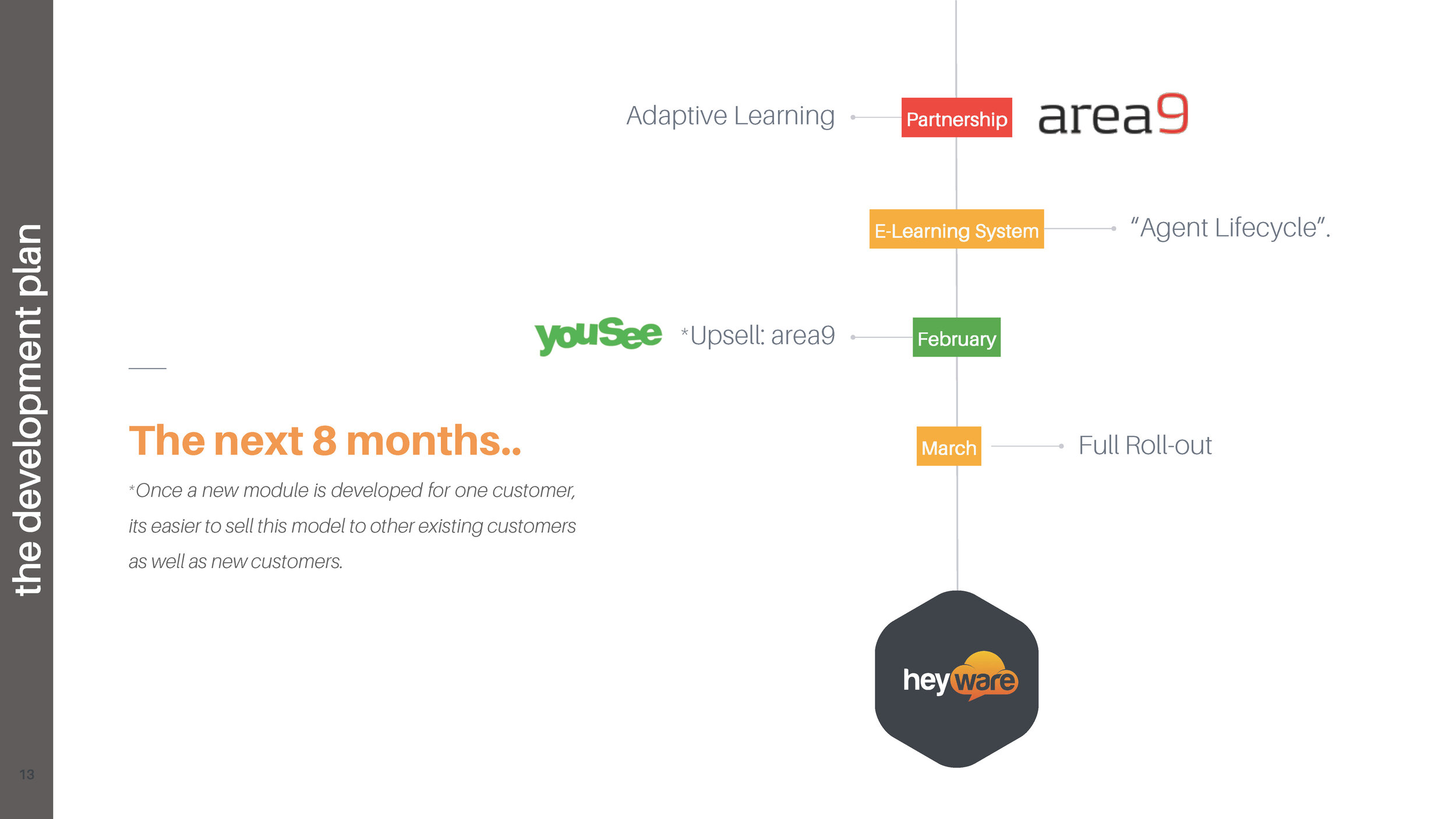
In this visual timeline, we've captured the strategic roadmap for Heyware's upcoming eight months, a period poised for remarkable growth and development. At aPitchDeck.com, we specialize in bringing our clients' future milestones to life, and this image is a testament to that. It showcases key initiatives such as partnerships, system upgrades, and full-scale rollouts with a timeline that clearly communicates the planned progression. This slide not only details Heyware's expansion but also reinforces the scalability of their business model—emphasizing the ease of replicating success across new and existing customer bases. Such visuals are crucial for our clients when they communicate their vision to stakeholders and investors.

Our crafted slide for TMG outlines the 2016 strategic focus areas in product development, with a timeline that undulates like the very innovations it represents. The journey through security, mobile, integration, and portfolio management is not just a path but a narrative of evolution and focus that aPitchDeck.com skillfully brings into focus. Each stop on the timeline is an opportunity to delve deeper into TMG's commitments to their product space, demonstrating a strategic approach that aligns with market needs and company strengths. This graphic aids TMG in showcasing a clear direction for development, underlining the precision of their long-term planning.
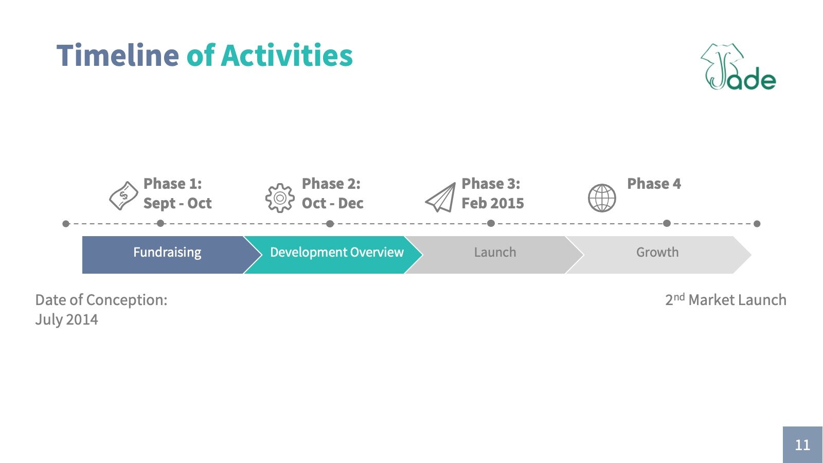
This timeline slide illustrates the critical phases of Jade's business journey, from the initial fundraising efforts to a robust growth phase, highlighting the pivotal moments in their evolution. At aPitchDeck.com, we excel in distilling the essence of our clients' trajectories into a coherent visual story. This slide maps out Jade's milestones over a clearly defined timeline, providing a snapshot of the company's strategic planning and execution from conception to the second market launch. It serves as an invaluable tool for communicating progress and potential to investors, encapsulating the momentum of Jade's journey in a clear, concise, and visually engaging manner.

The Accelerator Program slide we created for the collaboration between BMW Mini and Urban.us (now known as Third Sphere) exemplifies our ability to synthesize complex programs into clear visual narratives. The circular timeline represents the cyclical nature of the accelerator, emphasizing key components such as mentor meetings, investor introductions, and the culmination in demo day. This visual effectively conveys the intensive three-month cycle designed to propel startups towards their goals. The clarity and structure of the timeline reflect our commitment at aPitchDeck.com to aiding clients in illustrating their developmental processes. To hear the value of our work firsthand, the managing partner of the fund provides insights in a video testimonial, affirming the success of our collaborative efforts.
"how it works" SLIDES
The "how it works" slide is a great way to show how your product or service works. This can be helpful in explaining a complex process or concept. It can also be helpful in showing how your product or service is different from the competition.

This informative slide succinctly demystifies the operations of Alumni Syndicates on AngelList, a crucial platform for startup investment opportunities. Crafted by aPitchDeck.com, it illustrates the streamlined process where Syndicate Leads — with deep university and startup ecosystem ties — submit potential investments to AngelList. Upon approval, these leads are empowered to distribute the deal to a community of alumni backers, fostering a virtuous cycle of investment and growth. Leads take an active role in championing each deal, ensuring that every investment opportunity is thoroughly vetted and presented to group members. This visualization not only simplifies the intricate process but also serves as an essential communication tool for investors looking to understand the dynamics of alumni-led syndication. The effectiveness of our visual articulation is echoed in a testimonial video from the AngelList team, highlighting the clarity and impact of our work.
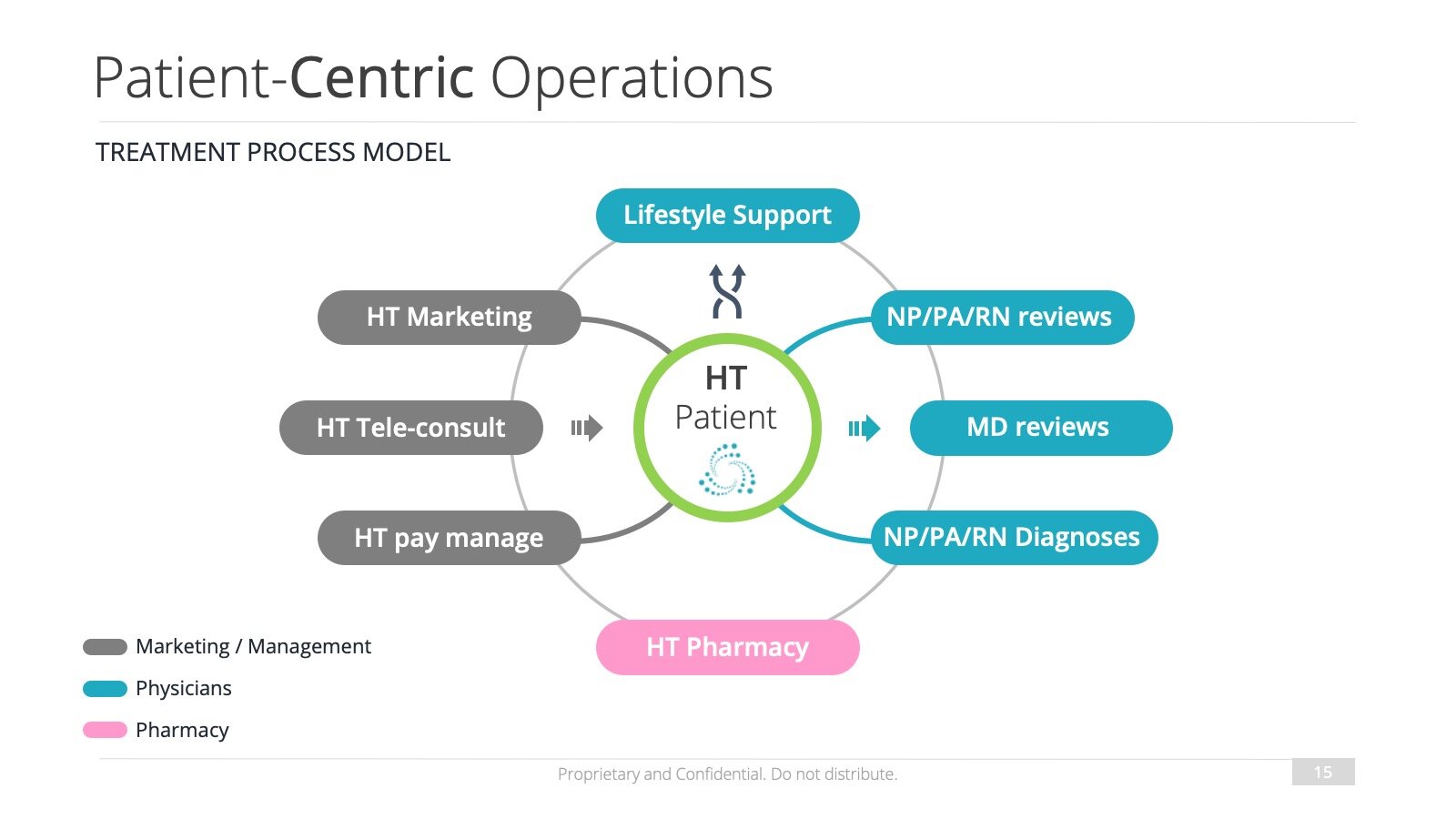
This slide is a stellar example of how aPitchDeck.com transforms intricate operational models into clear, visual formats. The 'Patient-Centric Operations' model illustrates the treatment process flow, highlighting the interconnectedness of various departments — from marketing and tele-consultations to pharmacies — all revolving around the patient. This visualization underscores the commitment to a healthcare model that prioritizes patient needs and streamlines their treatment journey. It serves as a powerful tool for demonstrating to investors how each component of the operations contributes to a holistic, patient-centered care ecosystem.
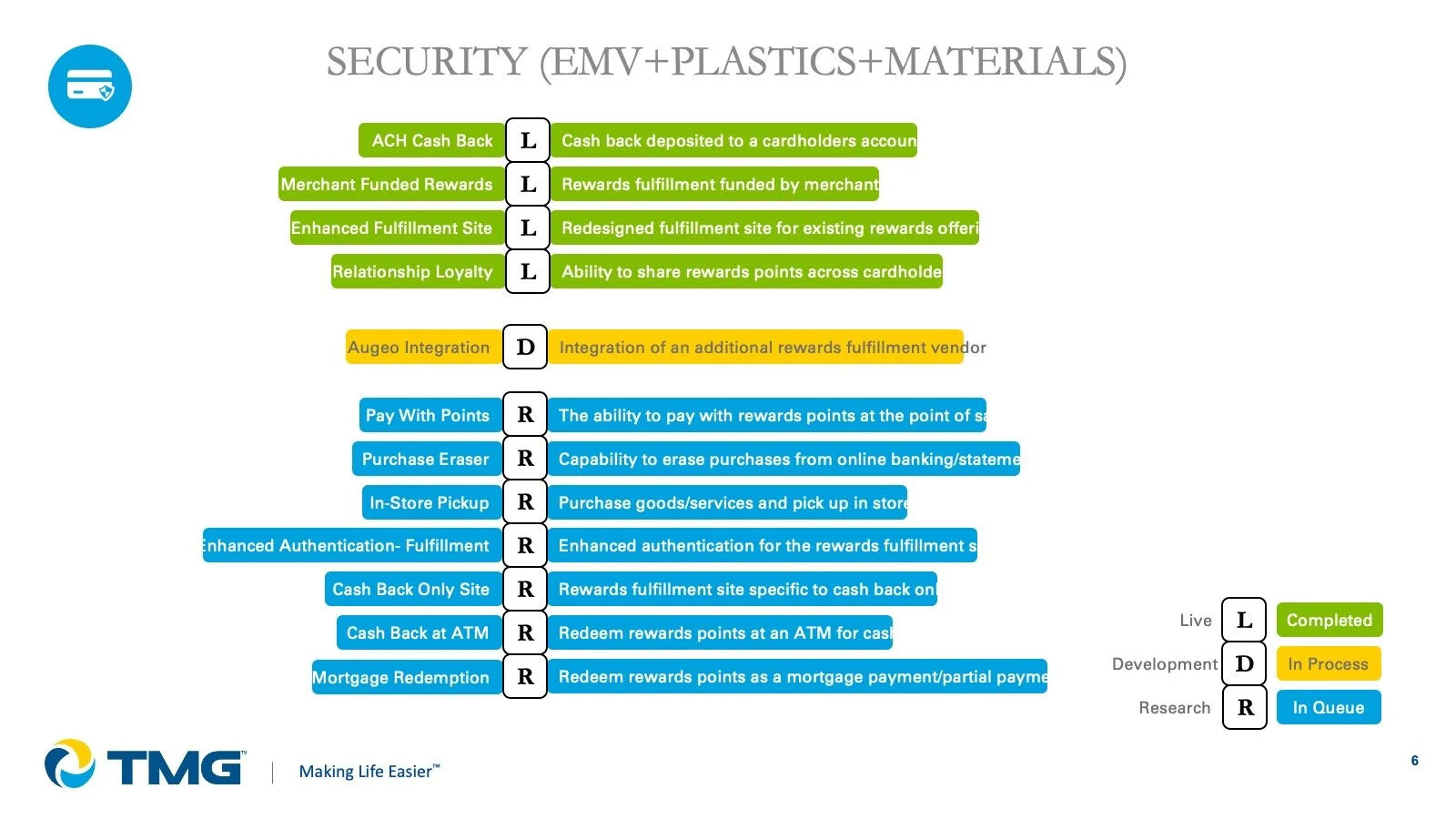
At aPitchDeck.com, we have the expertise to clarify complex processes for our clients. This slide for TMG delineates the detailed roadmap for security features related to EMV, plastics, and materials, using a color-coded system to indicate the status of each feature. The graphic effectively conveys where each item stands in the development process, from live implementations to those still in queue. This visual tool is an invaluable asset for stakeholders and investors alike, providing a clear snapshot of TMG's product development journey and strategic focus on security, rewarding their customer's loyalty through innovative reward systems.
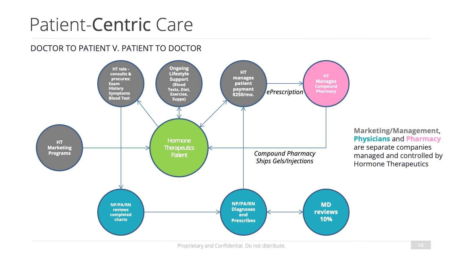
The 'Patient-Centric Care' slide, another aPitchDeck.com creation, further emphasizes the company's dedication to patient-focused healthcare. It contrasts the traditional doctor-to-patient approach with a revolutionary patient-to-doctor model, showcasing a bidirectional flow of care and communication. This model clearly outlines how marketing, management, and pharmacy are seamlessly integrated, providing a transparent view of the entire ecosystem that supports the patient. For investors, this slide is instrumental in highlighting how the company's operations are structured to enhance patient engagement and treatment efficacy.
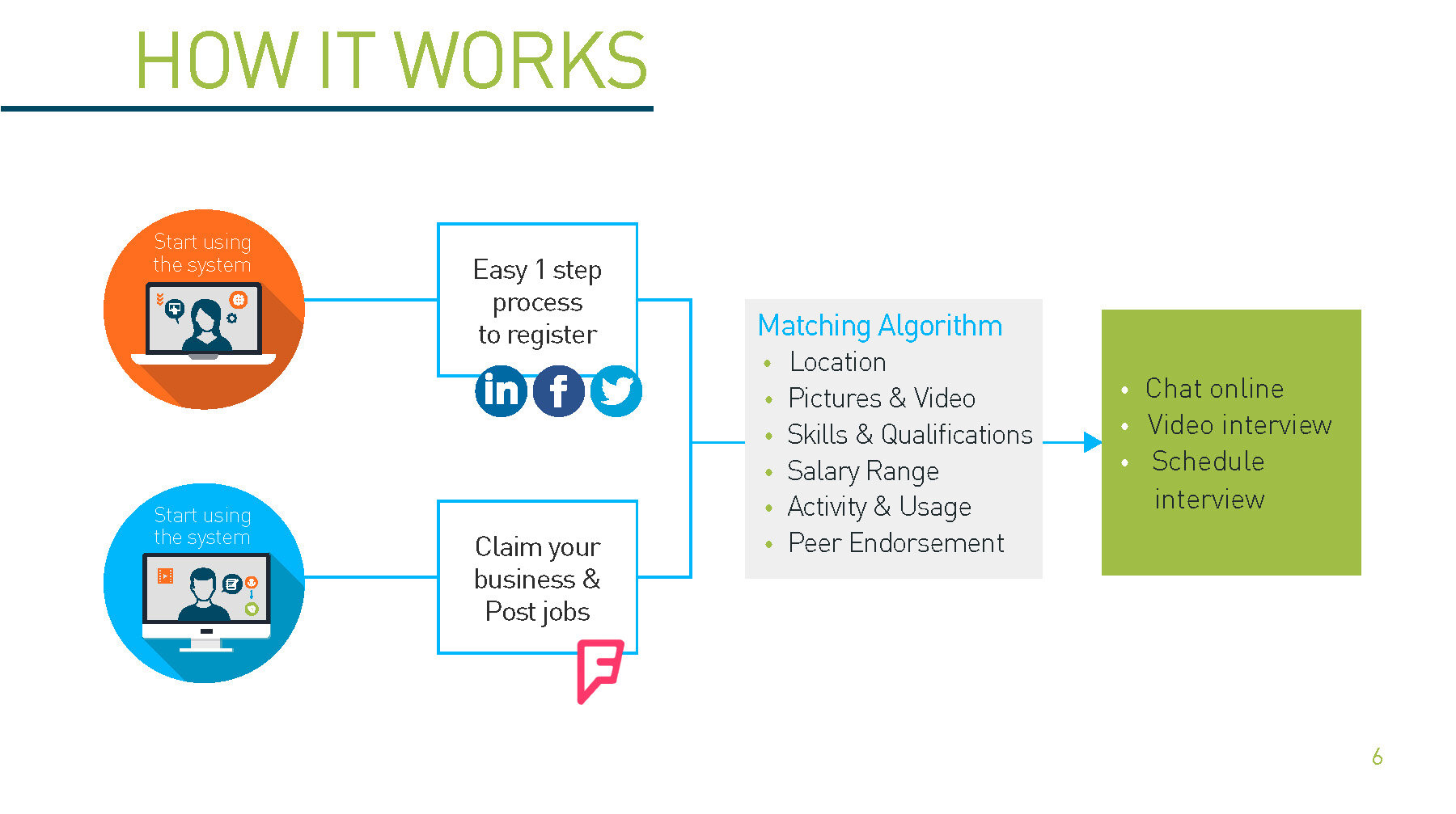
Our work with YapJobs illustrates the simplicity and efficiency of their job matching platform. This slide by aPitchDeck.com breaks down the 'How it Works' of the system into an effortless narrative: starting with a one-step registration process, advancing through a sophisticated matching algorithm, and culminating in interactive features such as chat and video interviews. This visual representation is designed to quickly convey to investors the user-friendly nature of the platform and the seamless experience it offers to both employers and job seekers. It's a testament to our ability to distill complex functionalities into an engaging and straightforward story that resonates with users and investors alike.
ISOMETRIC GRAPHICS
An isometric graphic is a type of graphic that uses geometric shapes to create an illusion of three-dimensional space. This can be helpful in making complex information more understandable and visually appealing.
Isometric graphics can be used in a variety of ways, but they are often used to create diagrams or illustrations.

The isometric graphic for Anatha showcases our commitment at aPitchDeck.com to precision and clarity, especially when elucidating the intricacies of the cryptocurrency investment landscape. This meticulously designed graphic lays out the strategic roadmap for 'Project Kampuchea,' navigating through various stages of a digital asset fund's lifecycle, from ICOs to engaging with high net worth individuals. The utilization of isometric design allows for a 3D representation of the process that is both engaging and informative, facilitating a deeper understanding of complex financial instruments and investment strategies. It's a clear demonstration of our dual expertise in comprehensive financial comprehension and high-caliber technical design, tailored to demystify sophisticated terms and processes."

For EFTPOS Australia, aPitchDeck.com crafted an isometric illustration that distills the complex journey of payment processing into a singular, comprehensible visual narrative. This graphic navigates the user through a step-by-step process from transactions at the point of sale to the final clearing and settlement. Each phase is highlighted with vibrant, distinguishable elements, making it easy for viewers to follow and understand the entire payment system. This level of detailed and technical design is indicative of our ability to convey intricate fintech operations in an accessible manner, which is essential for companies seeking to explain their services to clients and investors without oversimplifying their sophisticated technologies.
BEFORE-AND-AFTER graphics
A "before" and "after" sample is a type of graphic that shows how your product or service has improved over time. This can be helpful in showing the results of your work.

For Qorus Docs, aPitchDeck.com created a transformative 'Before and After' isometric graphic that encapsulates the company's comprehensive solution for document automation and collaboration. The 'Before' side presents isolated business functions with weak interlinks, reflecting the silos that often hinder productivity and coherence. The 'After' side, however, transforms this landscape into a dynamic, interconnected workflow enabled by Qorus Docs. Integrating seamlessly with Microsoft Office and CRM platforms, Qorus Docs facilitates the creation, management, and sharing of business-critical documents, fostering a synergistic environment across marketing, sales, and leadership. This graphic conveys the efficiency and connectedness that Qorus Docs brings to an organization, streamlining the document lifecycle and empowering teams with a more collaborative and productive document management system.

The 'Before' isometric graphic designed for Faultless.ai by aPitchDeck.com vividly outlines the traditional operational workflow within an organization. It identifies critical junctures prone to errors, as indicated by the red crosses, where inefficiencies and bottlenecks are common. This visualization serves as a baseline representation of the status quo, effectively setting the stage for the necessity of innovation. By mapping out each step of the existing process, we not only pinpoint where the system falters but also provide a clear, visual benchmark against which to measure the impact of Faultless.ai's AI-driven improvements.

In contrast, the 'After' graphic by aPitchDeck.com demonstrates the optimized process flow post the integration of Faultless.ai's AI technology. This streamlined sequence reveals the elimination of previous failure points, showcasing a smoother, more efficient path from 'Solution' to 'Production'. The blue arrows depict a faultless transition between stages, emphasizing the AI's capability to enhance and refine operations. This after-state is a powerful visual tool that communicates the tangible benefits of Faultless.ai's AI solutions, highlighting the potential for increased accuracy and operational efficiency.
we can convert your HAND SKETCHes to either 2D or 3D graphics

aPitchDeck.com proudly presents our client showcase featuring Synchronoss Inc, a NASDAQ-listed leader in cloud, messaging, and digital innovations with a market capitalization of approximately $190M. Our team was tasked with a pivotal project: transforming hand-drawn sketches into custom vector-based isometric illustrations and animations. This transformation was intended to elucidate Synchronoss Inc's complex technology offerings for their clients and end-users, significantly enriching their annual report. The concept of 'marketecture'—a portmanteau of 'marketing' and 'architecture'—played a central role, as we architecturally structured and designed each infographic to visually narrate the company's market-facing solutions. Our collaboration is further endorsed by a video testimonial from the VP of Global Marketing at Synchronoss Inc, attesting to our swift turnaround and impactful visual storytelling.

In a project characterized by rapid execution and creative agility, aPitchDeck.com translated hand-drawn sketches into pristine digital isometric illustrations for Synchronoss Inc. This first slide showcases the initial transformation, where the essence of a conceptual draft is brought to life in a detailed, multi-dimensional graphic. These illustrations are pivotal in illustrating Synchronoss Inc's intricate workflows and technologies in an accessible and engaging manner, embodying the core of marketecture by merging intricate marketing narratives with precise visual design.

The second slide in our series for Synchronoss Inc illustrates the evolution from a foundational hand sketch to a polished, digital isometric illustration. The original ideas, once captured in simple doodles, are now presented in a vibrant, structured format that captures the attention of clients and investors alike. This translation from paper to pixel exemplifies aPitchDeck.com's capability to not only understand but also visually articulate the sophisticated ecosystems that Synchronoss Inc operates within.

Slide three demonstrates aPitchDeck.com's meticulous process of converting rough sketches into comprehensive digital isometric illustrations for Synchronoss Inc. Our visual storytelling brings clarity to the telecommunications giant's offerings, enhancing the user's understanding of their services. The final graphic is a testament to the power of marketecture in action—enabling Synchronoss Inc to effectively communicate the benefits and functionalities of their technological solutions through a single, coherent visual journey.

In this fourth slide, we showcase the transformative journey from hand sketches to digital isometric illustrations for Synchronoss Inc. This step in the visual evolution highlights aPitchDeck.com's expertise in crafting an engaging narrative from simple concept drawings, aligning with Synchronoss Inc’s commitment to simplifying complex digital solutions for their customers. The resulting illustration not only serves as a communication tool but also as a strategic asset in Synchronoss Inc’s marketing arsenal.

This final slide encapsulates the culmination of aPitchDeck.com's creative endeavor with Synchronoss Inc, turning hand-drawn visions into digital reality. Our work underscores the essence of marketecture—bringing forth a visual language that resonates with the cutting-edge nature of Synchronoss Inc's digital solutions. The isometric illustrations stand as a visual bridge between the company's innovative spirit and the marketplace's need for understanding complex technological ecosystems.