Are investors satisfied with the way you present your financials?
Raise your hand (or roll your eyes) if you’ve seen a slide in a presentation that looks like the sample below, chock full of data across rows and columns.
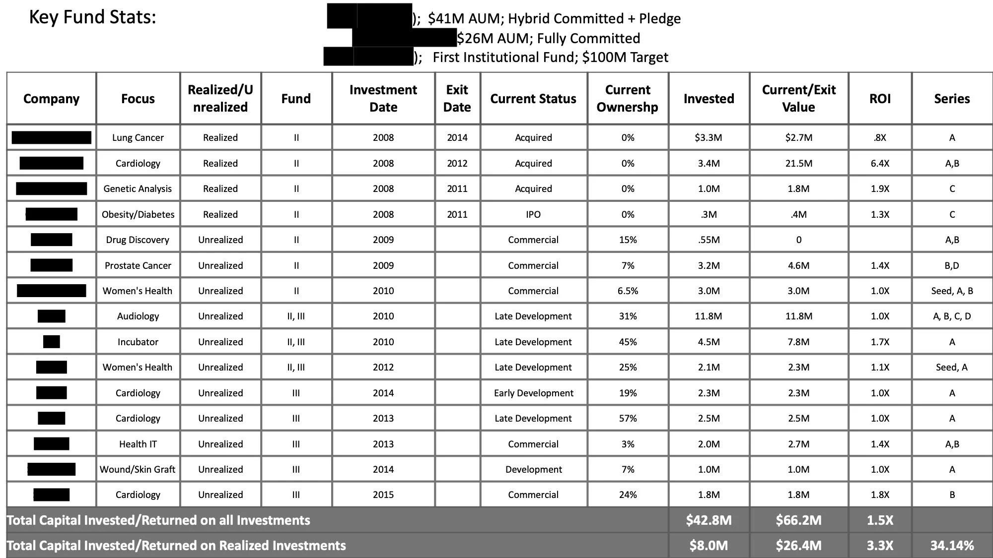
This is a real slide that we received from a VC fund not too long ago (names of companies redacted for privacy).
If you notice, the data in the excel shows the following:
Focus area of the investment
Realized or Unrealized investment
The number of the fund that deployed the investment (the VC firm had multiple funds)
The date of the investment
Current ownership
Amount invested
Current Value of Investment (or Exit Value if the investment was realized)
ROI of each investment
Stage of Investment (series A, B, C, D)
Total Capital Invested and Realized
This is great, isn’t it? It’s a lot of data and exactly what future investors would like to see before they invest in your new fund.
Well, maybe not. Investors today are a lot more sophisticated and have higher expectations than they did a decade ago. What if your investor were:
Short on time and would rather look at visual insights gathered from the data rather than the raw data itself?
Focused on a niche and wanted to know more about your performance in specific thematic area?
Focused on early-stage deals versus later-stage deals and wanted to know more about your performance across different stages?
We created a new model for the VC fund designed to answer these questions and also to provide a sophisticated tool for investors to engage with the raw data in ways they never could before. For example, now an investor could easily see:
That the firm had a 255% ROI on their Cardiology investments from 2008 and had continued to invest heavily in this field since the exit in 2008 ($6.6M across 3 new investments)

That the unrealized returns were currently generating a combined ROI of 124% across 6 investments.

That the fund had generated the largest returns (390%) across Series A&B investments across all their funds.

If you were an investor, which would you prefer? The raw-data-table from the start of this post? Or the insight-driven-dynamic graphs that you see above?
In our experience, sophisticated investors appreciate the effort that a company puts into making its data understandable. It has a tremendous effect on their confidence levels, and subsequently, on the valuation of the company (or fund or management team).
If you would like to take a look at the demo model that we created for this VC firm, or better yet, create a demo for your company based on your own data, please contact us! Like the management of the VC firm that we assisted, you’ll be glad you did!